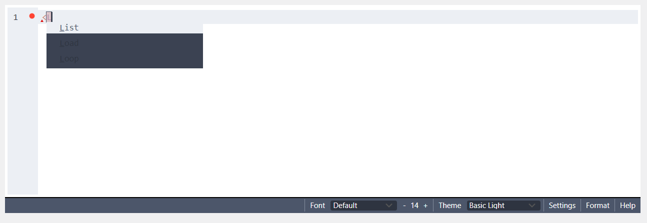
One thing - I’ve noticed the styles have changed and defaults to a dark theme which I find quite hard to read. If you switch it to “Basic Light” some of the elements still have a dark background, but so is the text - eg:
Looks like Basic Dark and Basic Light both have oddly low contrast in the autocomplete box. Maybe just try a different theme? Espresso or Tomorrow seem like solid light theme options that offer good contrast and readability. Solarized Light also seems like it’d be a good light theme that wouldn’t strain the eyes.
Hi Matthew, thanks for pointing out the issue with the light theme not working well with some editor interface elements like autocomplete. The issue is being tracked (#55), and hopefully will be improved soon.
Great, thanks for the suggestions and pending fix!
One other thing I’ve noticed - on all of the light themes you can’t see when text has been highlighted. I’m guessing because the highlight is just too light?