Problem
I use ACF a lot to manage my theme, and I have been wondering how to dynamically update things like the CSS background property, which I use to apply a background image to banners.
Solution
I finally realised I could do this using inline styles updated by L&L template logic since I can’t use logic inside an L&L style template.
I have this working, but it does get tricky since all the logic needs to sit inside the HTML style attribute. I followed @benjamin’s advice in this thread, which was helpful. ![]()
Here is the logic I am using to specify background properties for banners:
<div class="sim-section sim-banner {Field sim_banner_type}" style="{If field=sim_banner_background_type value=none}background: none; {Else field=sim_banner_background_type value=color /}background: {Field sim_banner_background_color /};{Else field=sim_banner_background_type value=image /}background: url({Field acf_image=sim_banner_background_image field=url /}) {Field sim_banner_background_repeat /} {Field sim_banner_background_attachment /} {Field sim_banner_background_position /}{/If}">
(This is hard to read because of the syntax used inside attributes)
Improvements
I am pretty happy with this solution, but one major downside of inline styles is that they don’t support CSS media queries, so currently, I am loading a desktop-sized image for mobile, which will slow down the page load.
Here are some solution options I am considering:
1. L&L Mobile Detect
One hack I thought of is to create a separate mobile-optimised image in ACF and use the Mobile Detect | Loops & Logic tag with an <IF> statement to load the right-sized image for the device. I’m unsure if using Mobile Detect is the right way to go here because it has limitations and will also increase page load times.
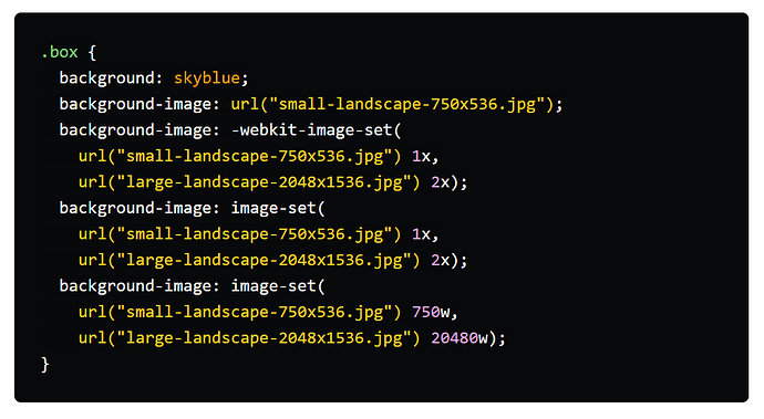
2. CSS background with image-set
The CSS background property can include multiple images for different pixel densities. However, it doesn’t solve my problem, as browser support for pixel widths (similar to media queries) is still evolving.
It’s explained well in this article but gets kind of complicated:
3. HTML picture
I’ve seen a few articles advising the <picture> element is well-supported by browsers now and can replace older approaches like CSS background with more flexibility. This sounds like a good option, but I have never used it before, and it will take some work.
Anyway, I will continue to research this, but if anyone else has thoughts, I would like to hear them. ![]()

